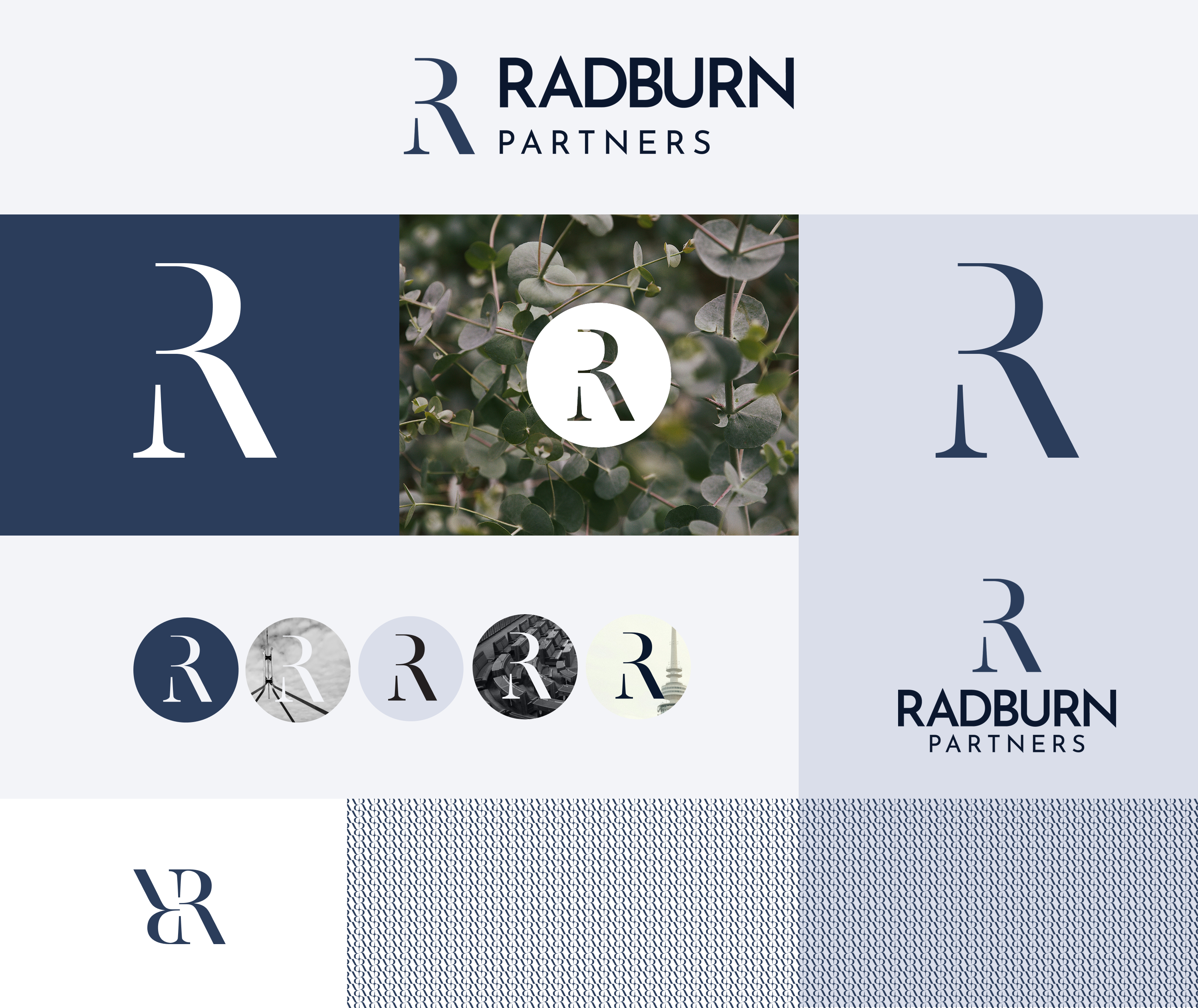
A timeless logo for the future
The brief was clear: A timeless logo that aligned with the gravitas of a credible services firm, without political associations.
We designed three options, with the chosen concept being a bespoke monogram crafted just for Radburn Partners. The logo is a refined, enduring mark that stands the test of time. Built on simplicity and strong design fundamentals, it communicates trust, professionalism, and sophistication without relying on temporary trends.
Paired with a subtle brand pattern, the full logo kit adapts to different uses while keeping the brand consistent and recognisable.
A brand toolkit designed to empower and futureproof
We created a full suite of branded assets to support the client’s transition to this new name and visual identity. This included:
- Polished report and presentation decks: Templates were created in Microsoft Office to be adaptable for future requirements and easy to update and use.
- Business cards: These featured a subtle embossing treatment to create a tactile, premium finish. This intentional design choice helped leave an impression at networking events.
- Suite of social media graphics: Which ensured the new brand could be applied consistently across digital and physical touchpoints.
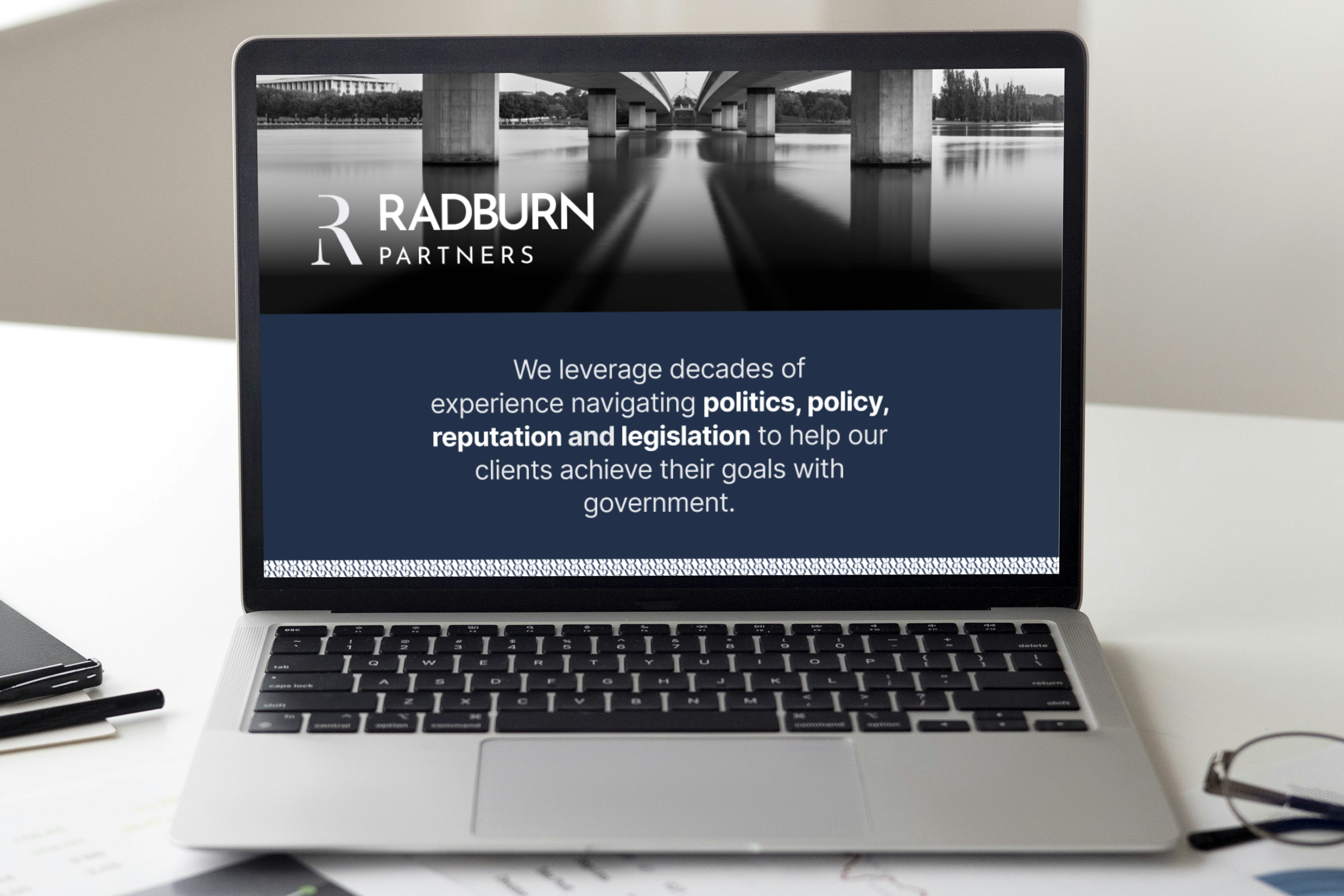
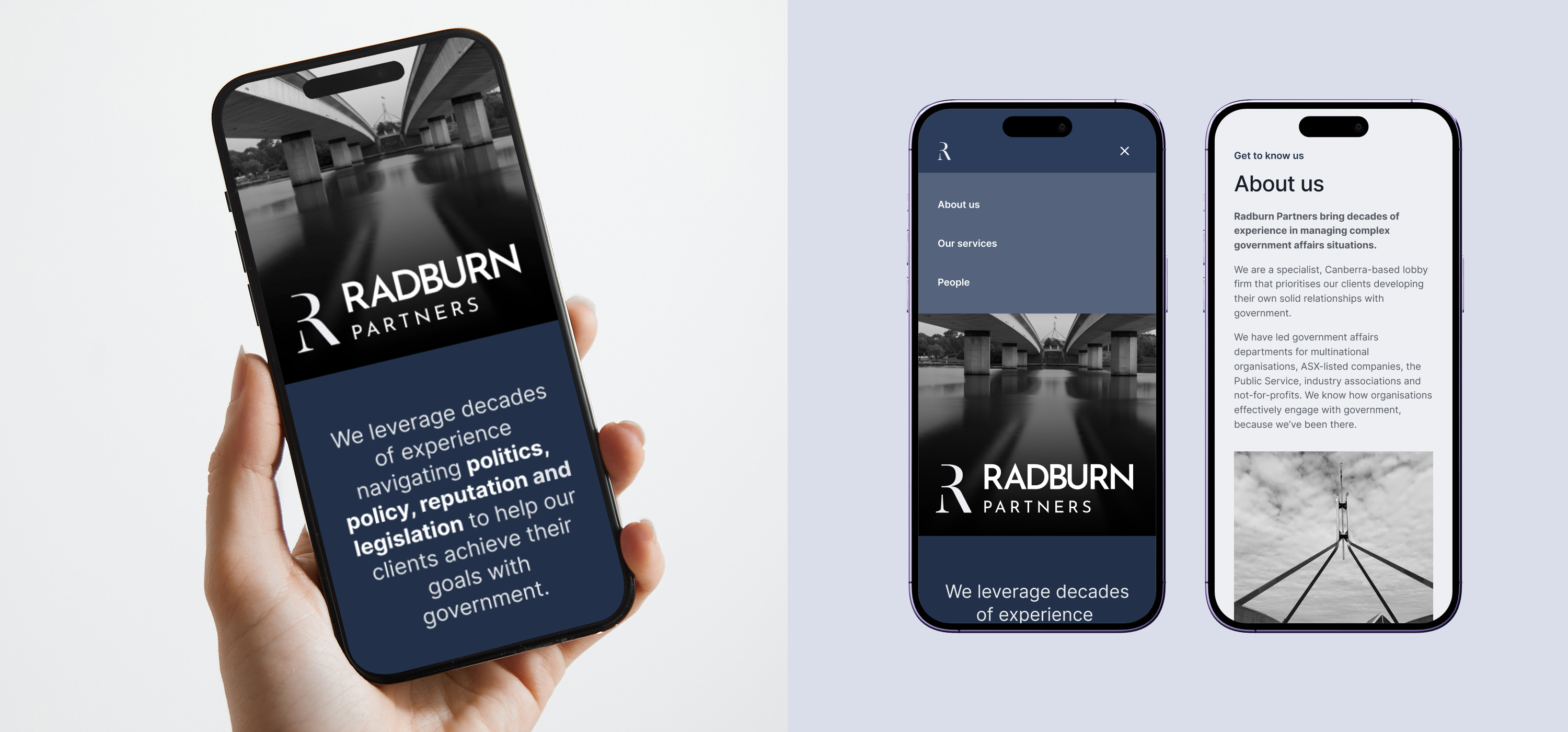
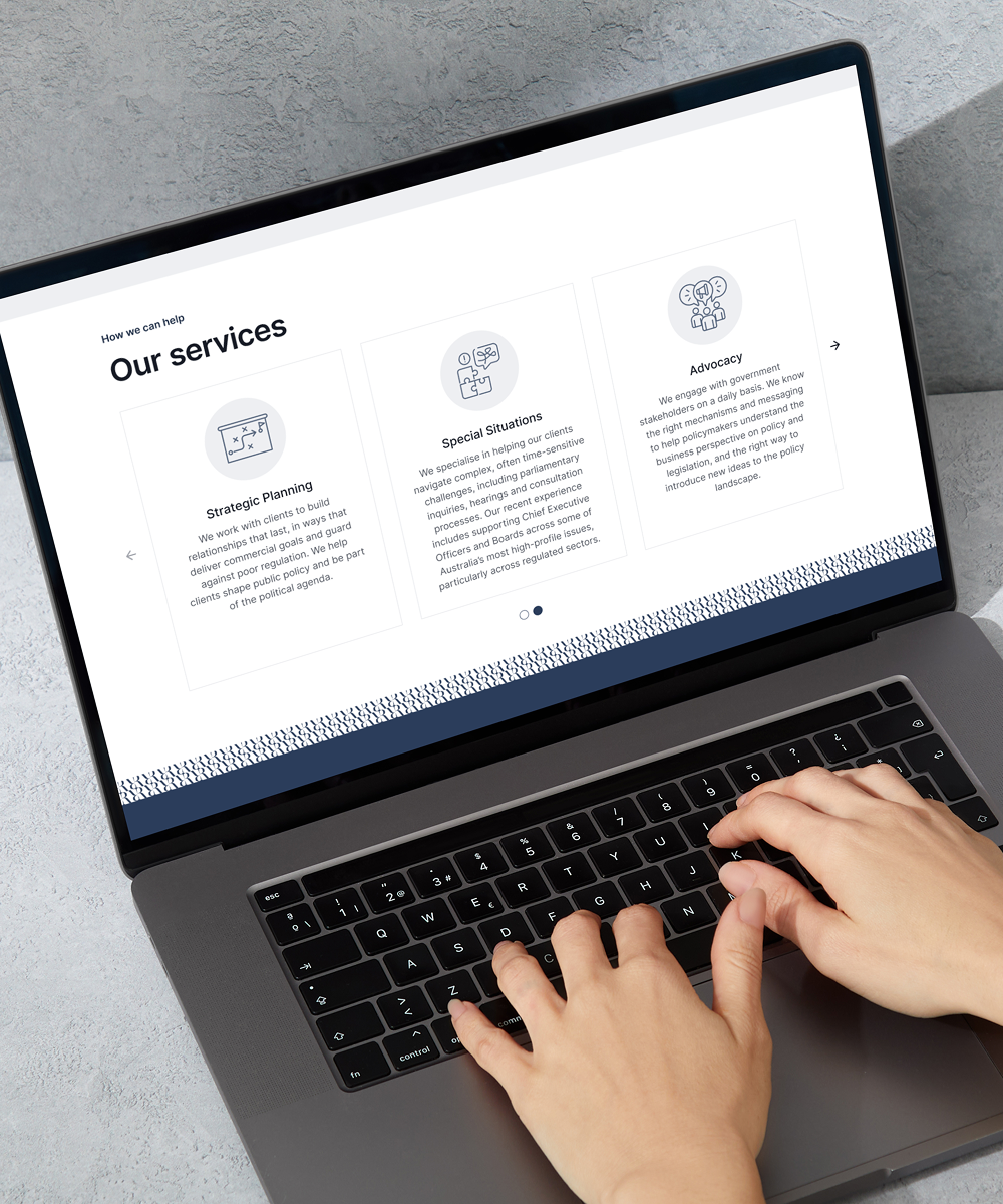
A website built smart and simple
The newly minted, Radburn Partners, also needed a clean, responsive site to reintroduce themselves to the world.
We kept things simple – building a single-page website in Webflow, featuring staff profiles and a clear statement of who they are and what they stand for.
Using Webflow empowered Radburn to make the changes themselves, and we provided training to give them the confidence and skills to do so.